Everything it does, in the order you will meet it.
No feature list padding. If something is not here, it is because the app does not do it — and there is a section at the bottom that says so plainly.
Entry is the part you do three hundred times a year.
One row, four fields
Date, amount, category, how you paid, and a note if you want one. Press Enter and it files; the date stays where it was so a backlog of six receipts is six quick presses.
A keypad on the phone
Tap the plus, a full-height sheet comes up with a proper number pad, category chips and payment chips. No fiddling with a tiny field and the wrong keyboard.
Amount shorthand
Type 2.5k and it files 2,500. Type 1.2L and it files 1,20,000.
Paste 12,345 from anywhere and the commas are ignored.
Indian digit grouping
1,31,000 reads as a lakh and thirty-one thousand, because that is how you read it. Switch it to western grouping in Settings if you would rather see 131,000.
A limit per category, and a verdict you can argue with.
Every category has its own limit
And its own colour, which follows it through every chart. A category with no limit still gets tracked — it simply never scores.
Three states, and you set the thresholds
On track, watch, over. By default that is 80% and 100% of budget, but they are two fields in Settings and you should move them until the colours mean something to you.
Pace against the calendar
Spending is not even across a month, but an even line is still the most useful comparison there is. The app tells you how far ahead or behind it you are, in rupees, today.
Projected month end
Your daily average multiplied by the days in the month. Crude on the second, sharp by the fifteenth, and it is the figure that makes people change course.
Budgets from your own history
One button reads your last six months and fills every budget with what you actually spend, rounded. Far better than a number you invented.
A flag for large one-offs
Anything over a figure you choose gets marked in the list, so a single big payment does not quietly explain a whole bad month without you noticing.
Six views, each answering one question.
| View | The question it answers |
|---|---|
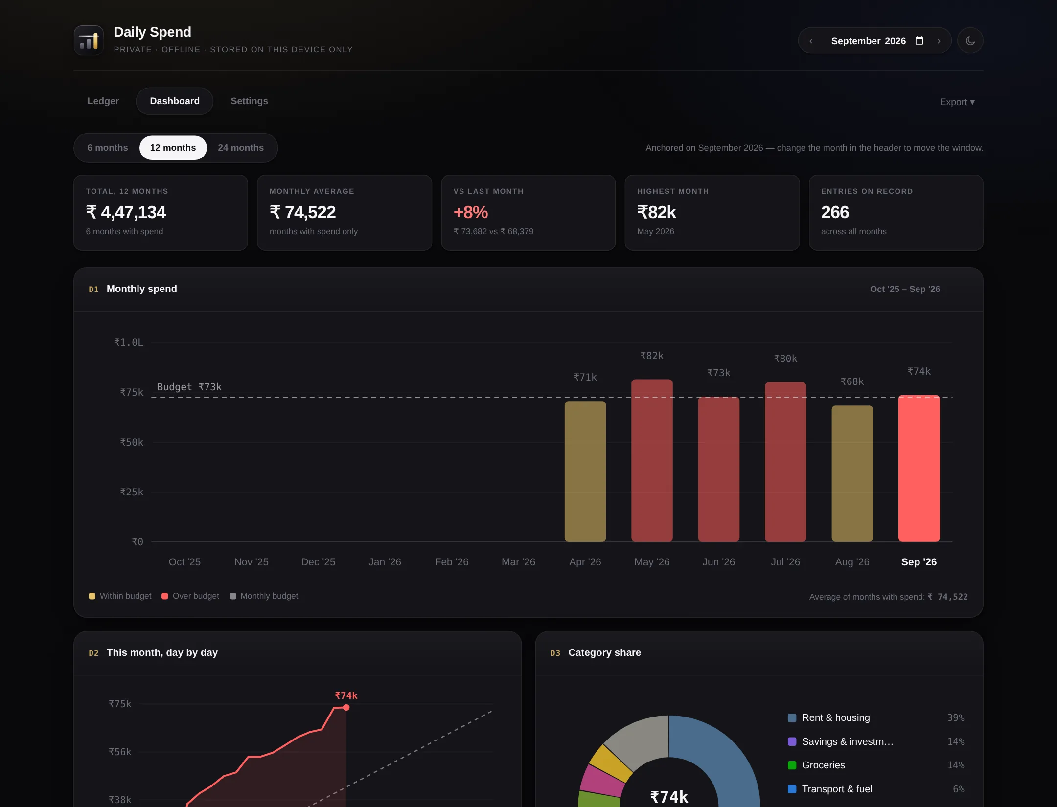
| Monthly spend | Am I getting worse? Bars for six, twelve or twenty-four months with your budget drawn across them. Over-budget months go red. |
| Day by day | Where did this month go wrong? A cumulative line against an even pace, so you can see the week it went sideways. |
| Category share | What is actually eating the money? A ring with the eight biggest, everything smaller grouped. |
| How it was paid | How much of this is on a card I have not paid yet? Split by cash, UPI, cards and transfers. |
| Biggest this month | What were the ten payments that mattered? With the date, category and mode on each. |
| Category by month | Which line item is drifting? A grid of every category against every month, with totals. |
A ledger is only worth keeping if you can search it.
Search everything
Notes, categories, payment modes and amounts, as you type.
Filter and range
Narrow by category or payment mode, or set a From and To date to look straight across months.
Grouped by day on the phone
With a running total for each day, and Today and Yesterday named rather than dated.
Five ways, none of which need our permission.
Spreadsheet
Three tabs: every expense, this month against its budgets, and a category-by-month grid.
CSV
This month or everything, for anything that eats CSV.
Picture
A PNG of the screen, for sending to somebody on a message app.
Print, or save as PDF. The edit controls are never in it.
Backup file
One JSON file holding every expense, category, budget and setting. It restores into either version.
Restore
The same screen reads a backup back in, from this app or from the other edition.
Every card opens its own setting
Hover a card and a small pencil appears. It opens the exact setting behind that card — a category row takes you to that category's budget, with the cursor already in it.
Dark by default, light for printing
One button in the header. The light theme exists mostly so a printed sheet does not drink a cartridge.
A blank is not a zero
A month with nothing in it reads as no data, not as nothing spent. The distinction matters when you look back a year later.
It remembers where you were
Theme, month, and the tab you had open. Close it and come back to the same screen.
Swipe between months
On the phone, left and right on the home and stats screens.
Sample data on demand
Six months of invented figures, one button, so you can see how it behaves before trusting it with anything real — and one button to clear it again.
The list nobody else publishes.
It does not track income
Spending only. Adding income turns it into a personal accounting system, and personal accounting systems are the ones people stop opening.
It does not connect to your bank
No account aggregation, no SMS reading, no UPI hook. Everything is typed in. That is the price of having nothing of yours on anybody's server.
The free edition does not sync
Each device keeps its own book. Moving between them means writing a backup and restoring it.
The free edition takes no photographs
Receipt images need somewhere to live that is not your phone's storage. That is a cloud feature.
No multi-currency
One currency symbol, set by you. It will not convert anything.
No reminders on its own
Nothing here is awake when the page is closed. A nudge when a category is about to go over needs a server, which is the cloud version.